As the sun begins to shine over Phoenix and New York, the iconic Hong Kong skyline has transformed into a nightscape. It is afternoon in London. In Dubai, the evening is drawing in…
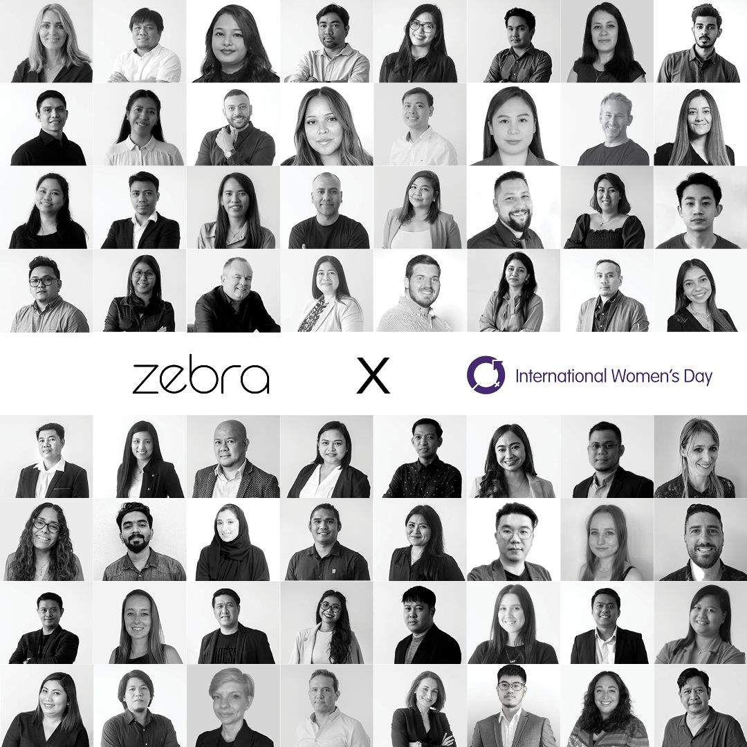
Twenty-three years ago, Zebra was a small team designing out of a single London office. A lot has happened in two decades; international growth, countless client successes, thousands of design transformations – and a pandemic. While the Zebra brand felt like a proud part of this growth journey, it didn’t reflect who we are today: a synchronised global family designing out of four offices for worldwide clients.
One item the pandemic afforded us was time. Time to pause, look inwards and reflect.
Soul searching
Changing our branding, which had been untouched for twenty-three years, felt challenging. It is part of the Zebra legacy. But we knew we needed to move the Zebra brand forward in a way that truly champions our design and creativity, communicates our global reach and highlights our commitment to our clients and partners.
We partnered with London-based brand agency Hudson Willow to strategically evolve our brand and achieve a new look and feel for Zebra.
Going behind the scenes
Together, through a lens of new perspectives, we deep dived into Zebra’s story, peeling back the layers of our history, our culture across four global offices, business ambitions and creative aspirations to reveal the characteristics, beliefs and values that make Zebra authentically Zebra.
Remaining authentic was a major focus in the rebranding process – taking the best of past and moving it forward in a way that would look and feel original, relevant and culturally connected.

Our transformation
Our new visual and voice identity preserves our heritage while shining a spotlight on our design approach, creativity and the personal touch we bring to each project. Flexible in its application for a global team, our visual identity works hand in hand with words that bring our design transformations to life.
We’ve evolved from zbr.co.uk into zbr.global, reflecting our global team, global reach and worldwide partnerships. Black and white text echoes our past while color – pulled in from project palettes – champions the brand environments we design. A truly unique presentation of the commitment we have and always will have to our clients and partners.
Design that Connects
Design that Connects is how we create the rich, lived experiences consumers desire and brands want to deliver. Our voice and visual identity convey this design approach; how we connect brand, consumer, location and space through sensory design that communicates with the five senses.
We are very pleased to say, we are Zebra and this is Design that Connects.

